Our Mission
Programs
Board and Officers
Organizations and Chapters
Contact Us
Legacy
Youth
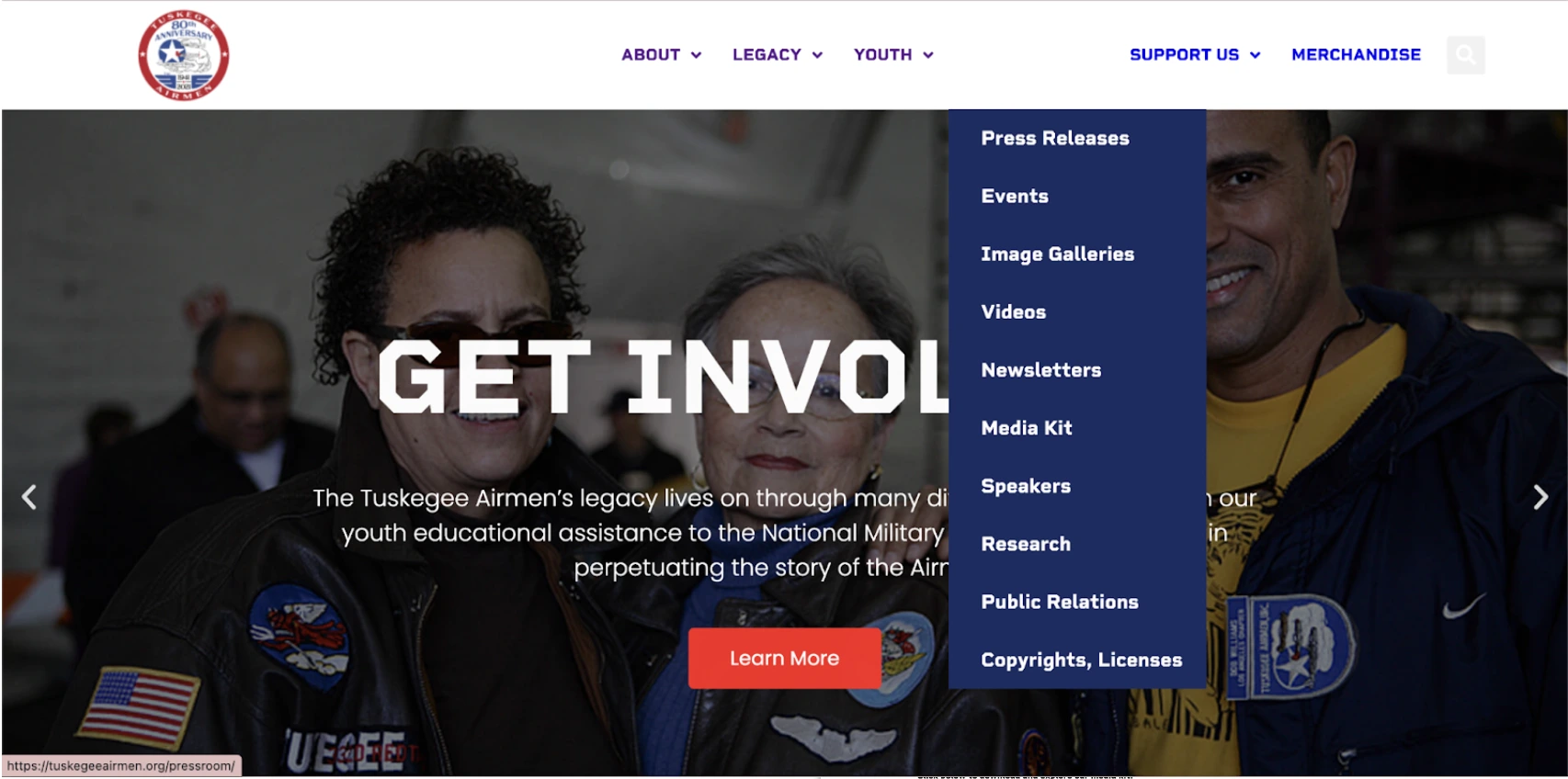
Press Releases
Media
Newsletters
Research
Donate
Merchandise
Members Signup
Tuskegee Airmen Inc. (TAI) is a nonprofit organization dedicated to preserving the legacy of African Americans who served in the Army Air Corps during WWII.
Through their initiatives, they provide educational support and inspire young people to pursue careers in science and aviation, upholding values like courage, leadership, and determination.
However, their website struggled with accessibility and engagement, making it hard for both older members and the next generation to connect.
Our redesign focused on enhancing clarity, usability, and creating graphic assets to strengthen their social media presence.
4 Months
UX/UI Design, Social Media
The website was overloaded with information but lacked clear organization.
Navigation was challenging for older, less tech-savvy users.
In addition, the site did not effectively engage younger audiences, limiting overall communication.
We redesigned the website with an intuitive structure and clear visual hierarchy.
Key improvements included
We also developed graphic assets for social media to improve audience engagement.
View Prototype 🔗40% decrease in website navigation time
Achieved over 80% user agreement on main navigation structure
We validated the problem with competitive analysis, user surveys, and card sorting exercises. This helped us focus on the most impactful areas for improvement.
Analyzing similar nonprofit websites revealed effective navigation and content flow strategies. We also looked at educational nonprofits for modern UI inspirations.
We surveyed users across various age groups. The feedback highlighted unclear paths for actions such as donating or signing up, which discouraged engagement.
Card sorting with board members revealed low agreement on subpage organization. We consolidated redundant tabs to achieve a more intuitive sitemap.

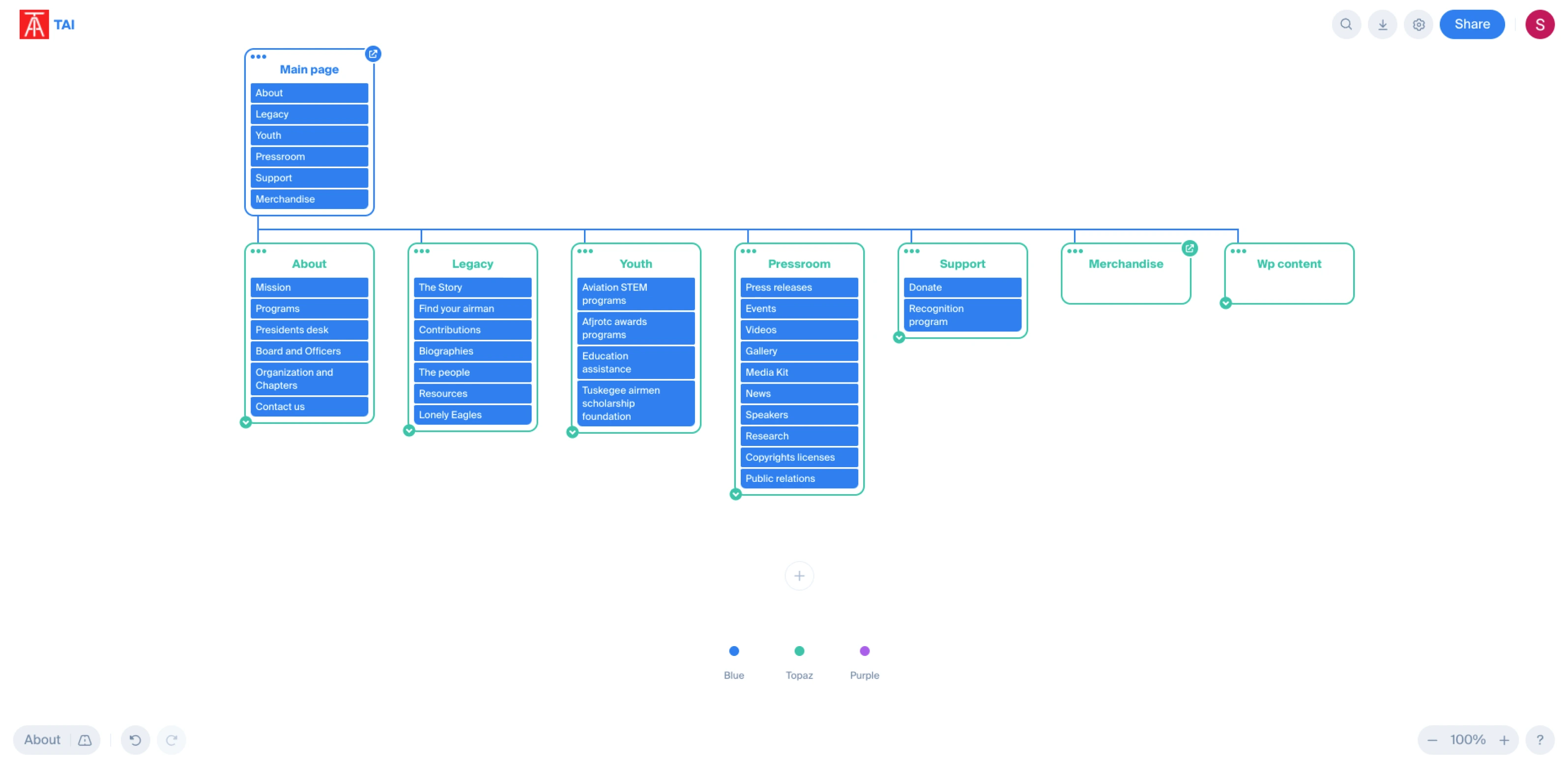
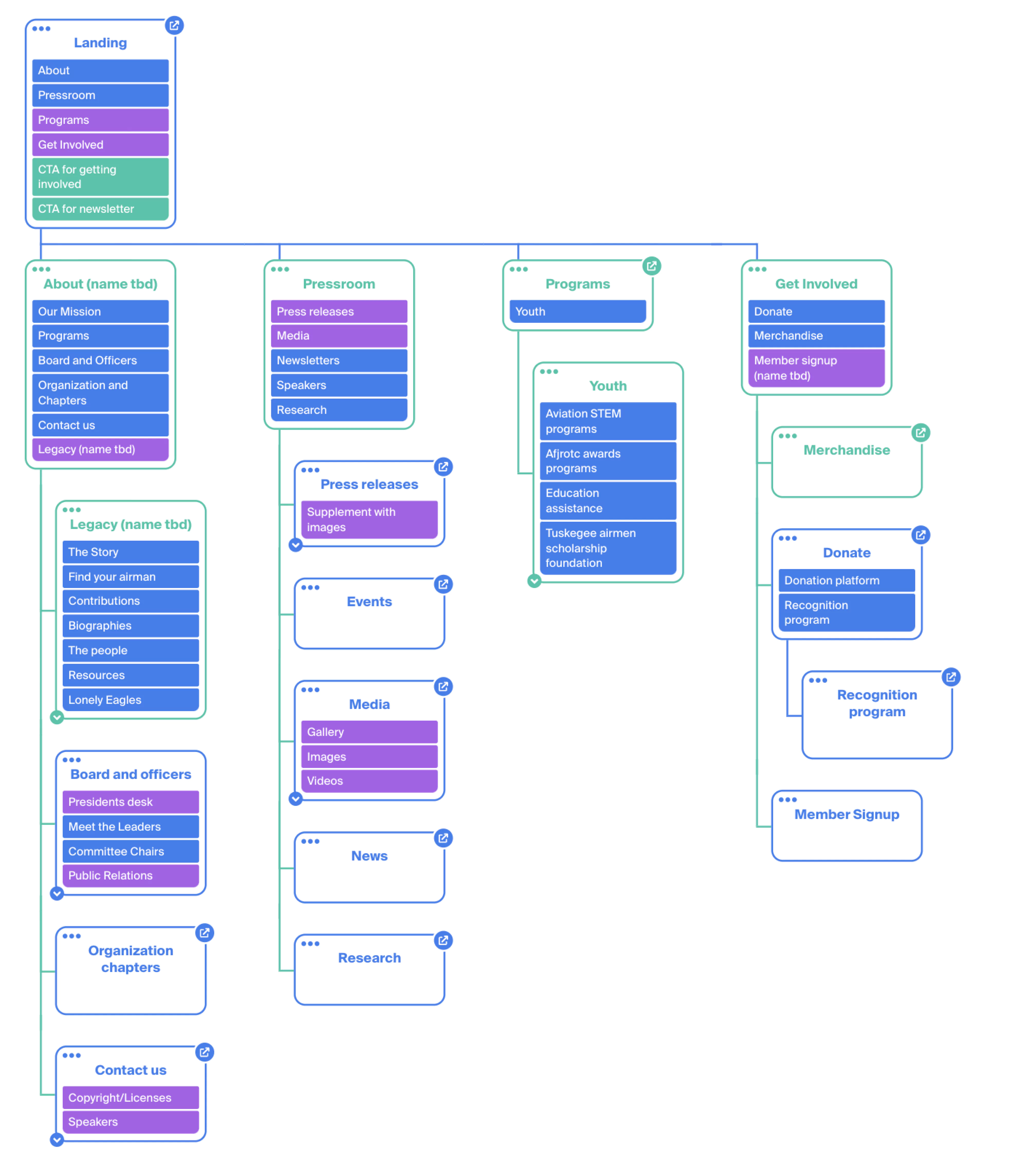
After analyzing user feedback and the current site structure, we developed a new sitemap.
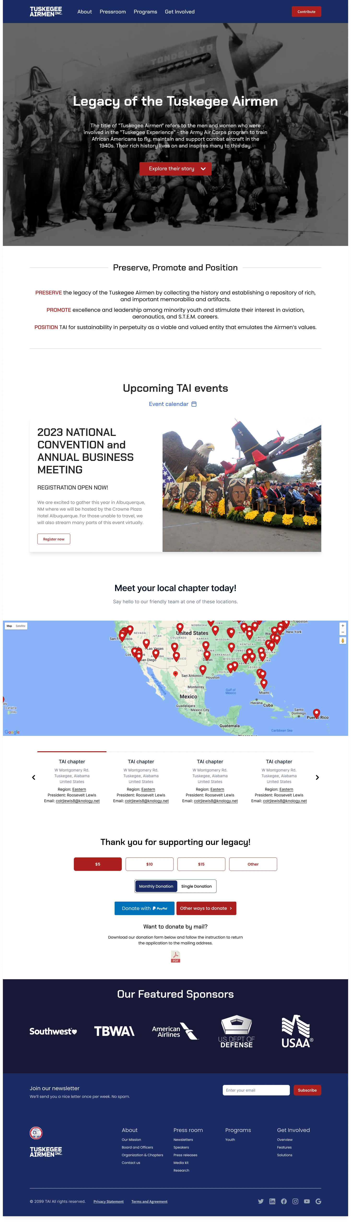
We reorganized content into four main tabs: About, Programs, Press, and Get Involved, consolidating redundant pages.
Our Mission
Programs
Board and Officers
Organizations and Chapters
Contact Us
Legacy
Youth
Press Releases
Media
Newsletters
Research
Donate
Merchandise
Members Signup
With the new sitemap approved, we built a style guide and design system in Figma.
Our style guide used TAI’s brand colors and introduced a new font for improved readability. Emphasis was placed on proper kerning and consistency.
The red, white, and blue palette was retained, with red as an accent, to honor the organization’s heritage. Accessibility was verified using A11Y’s Validator Tool.
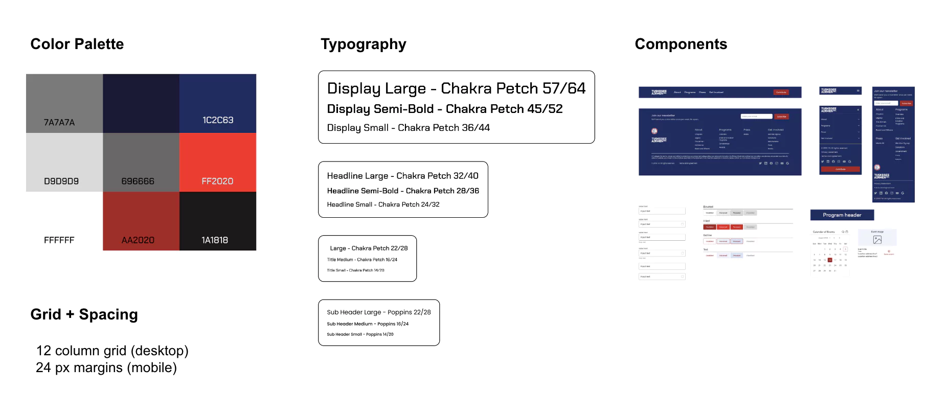
Designers worked on desktop and mobile layouts concurrently. Weekly update emails and feedback sessions helped us maintain consistency and reduce friction.
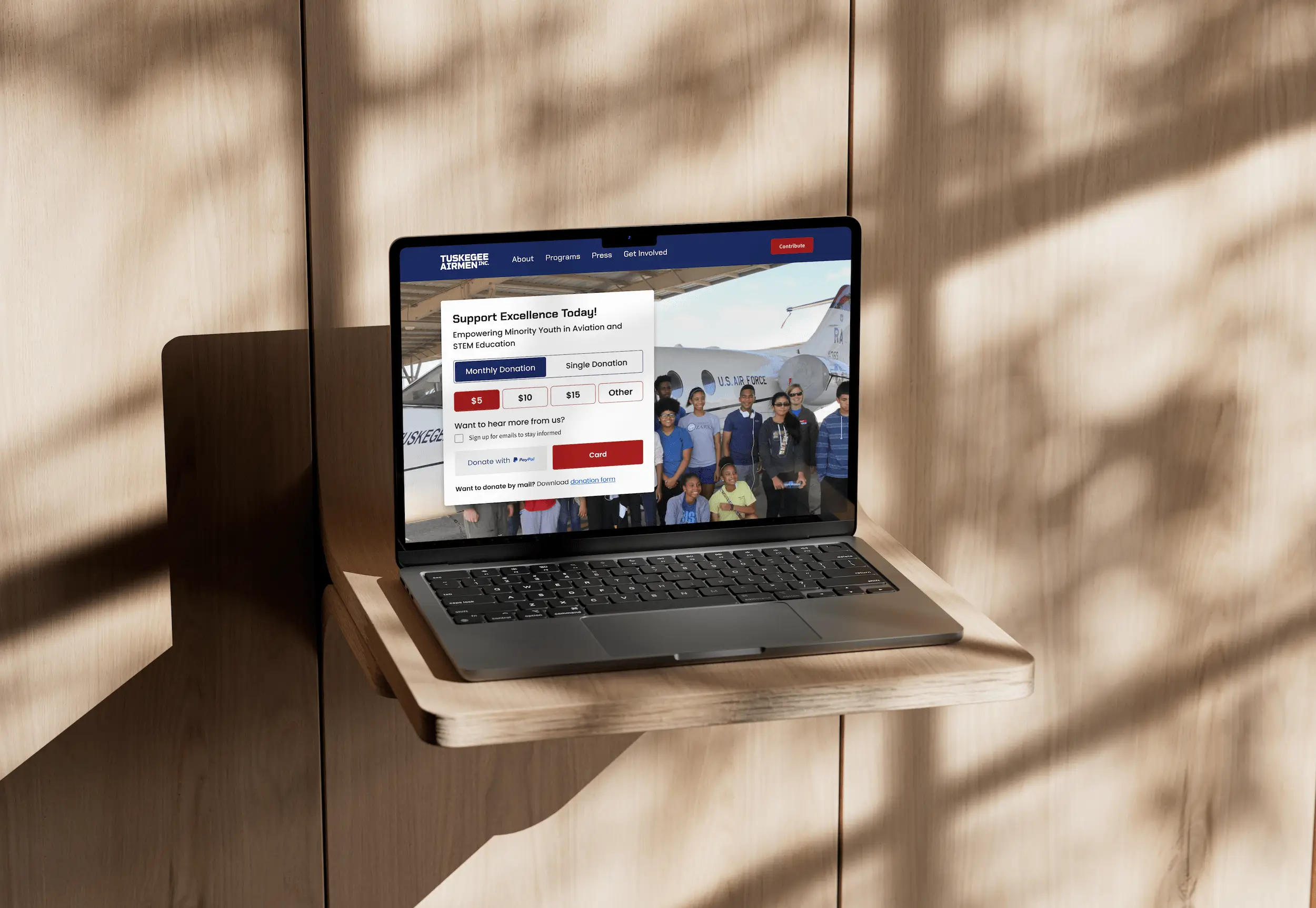
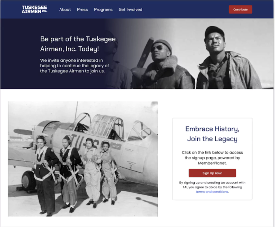
For example, the original member signup process required multiple steps. We streamlined it into a single, clear call-to-action.
The redesigned "Get Involved" tab now directs users to MemberPlanet with one click.
We also restructured the presentation of program offerings. Previously, programs were presented in dense text blocks with little hierarchy.
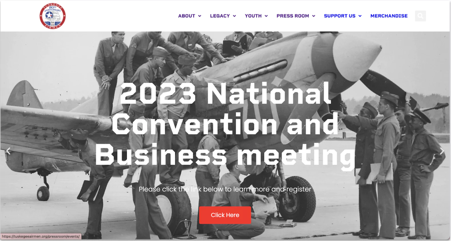
The new Overviews page uses media, banners, and improved spacing to showcase Programs, Scholarships, and Awards.
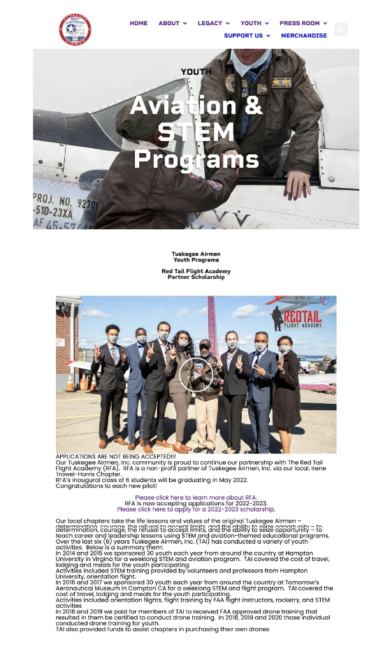
Visual separators and banners now guide users through the content more effectively.
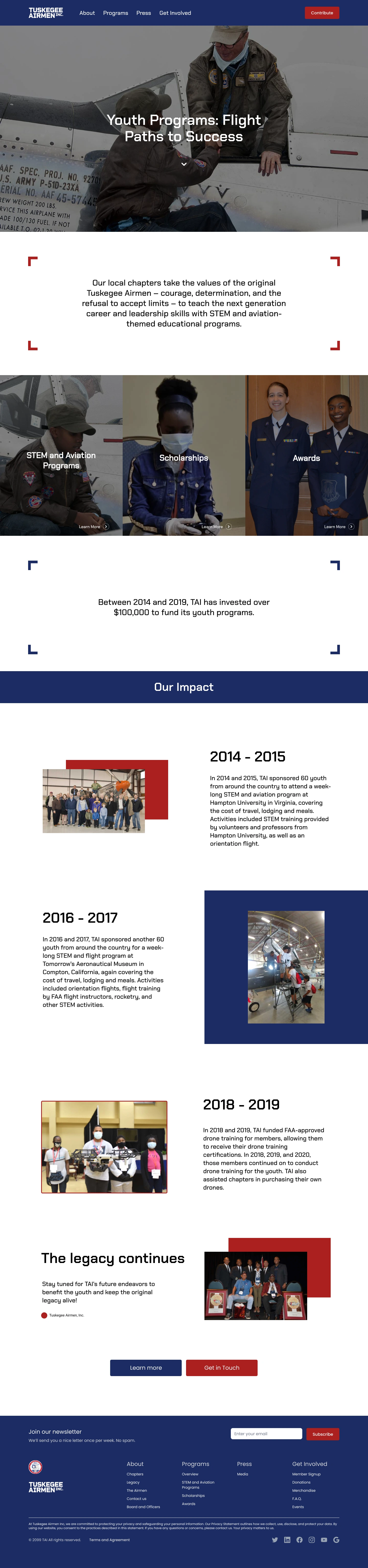
Additional banners highlight individual programs and yearly accomplishments.
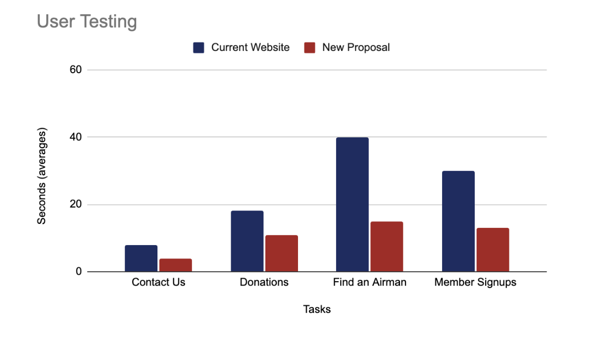
After creating a medium-fidelity prototype, we conducted user testing with timed tasks on both the old and new designs.
Results showed a 40% faster navigation time. Feedback from these sessions allowed us to fine-tune the high-fidelity designs.
To jumpstart TAI’s social media initiatives, we focused on:
Designed graphic templates for a cohesive social media presence.
Created a guide with a content calendar & best practices.
Our team brainstormed content topics and created templates on Canva. Examples include:
All assets and guidelines are compiled in our content strategy handbook.
Social Media Handbook 🔗We redesigned the information architecture, making it easier for users to find what they need.
We ensured the website met WCAG guidelines, improving usability for all users.
The site is now fully optimized for desktop, tablet, and mobile devices.
Our collaboration is expected to enhance communication, increase member signups, and create a more engaging online presence, based on insights from our usability testing.
Gather post-launch feedback and iterate on the design based on user insights.
Develop a plan for regular updates to maintain engagement and keep content fresh.
Track site analytics and usability metrics to measure effectiveness and make adjustments.
With the design vision established, TAI can now move forward with development, maintenance, and enhanced media organization to further boost their social presence.
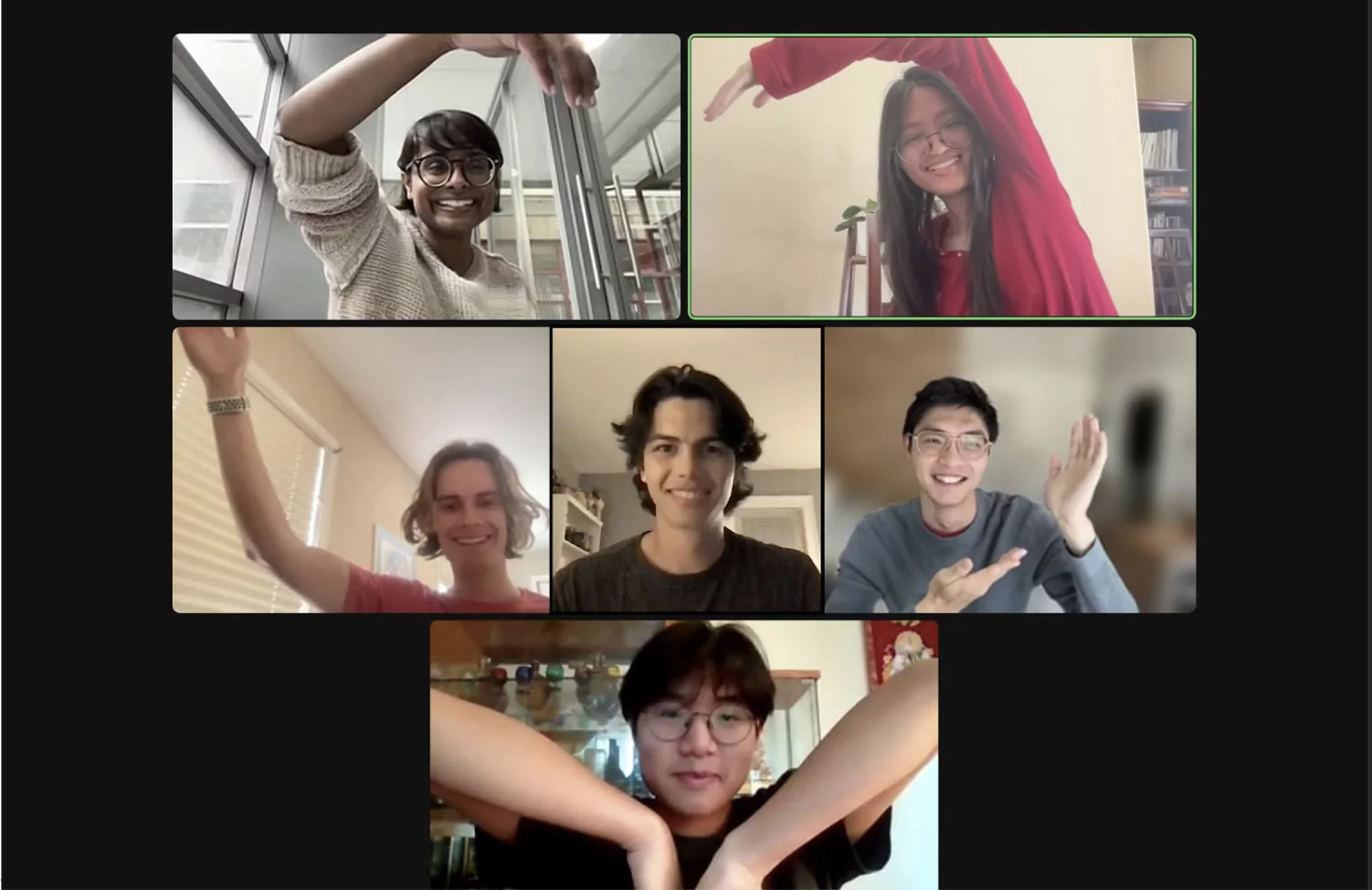
Design/Product Manager
Designer
Designer
Designer
Designer
Designer
We’d like to thank Develop for Good, especially Mary, Amanda, and our Project Lead Wesley, for this collaborative experience. Special thanks to our mentor, Jack Wang, for his invaluable guidance.